May 26, 2018

spring pinks
Rose Garden at the Descanso Garden, April 29, 2018 (mixed media on Canson Mix Media paper)

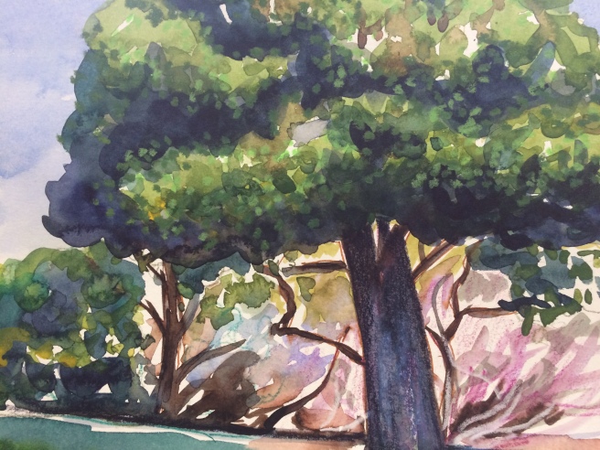
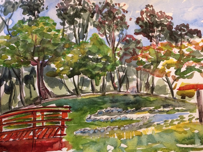
I guess I can’t seem to get out of the rose garden at the Descanso, and I just give up that I will paint anywhere else when I’m there—at least not in the foreseeable future. That part of the garden was just so full of such tantalizing spring colors and all. My mind was so full of ideas of how to capture those amazing pink spring blossoms and the new growth on the roses. Whatever! I give up! (If you haven’t read my blog before, I am lamenting the fact that every time I go to the Descanso Garden I always head for the rose garden to paint.) Oh well. So, before I begin to describe my color choices for this piece I should mention that I was trying out a new watercolor paper. (Actually it’s not watercolor paper at all, but rather a paper for mixed media.) It was ok, but I think I prefer that watercolor paper have more texture than this. It was pretty flat, with no little knobs or dents to obstruct the flow of the paint. In my opinion washes are more interesting when the paper has a subtle texture especially when rendering the sky—with clouds or a cloudless blue.

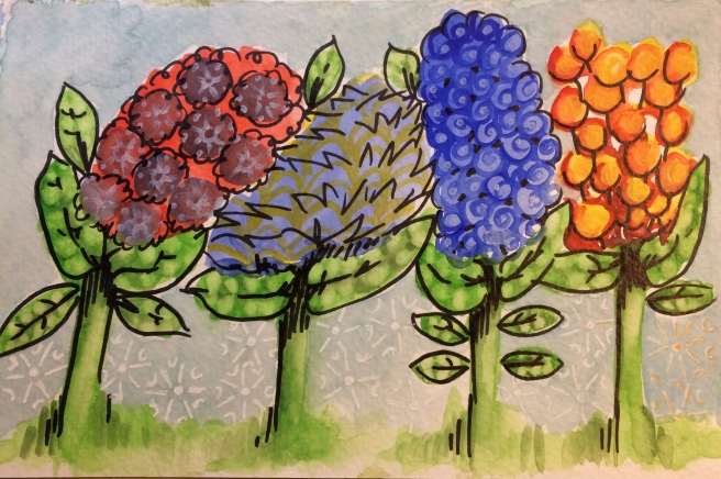
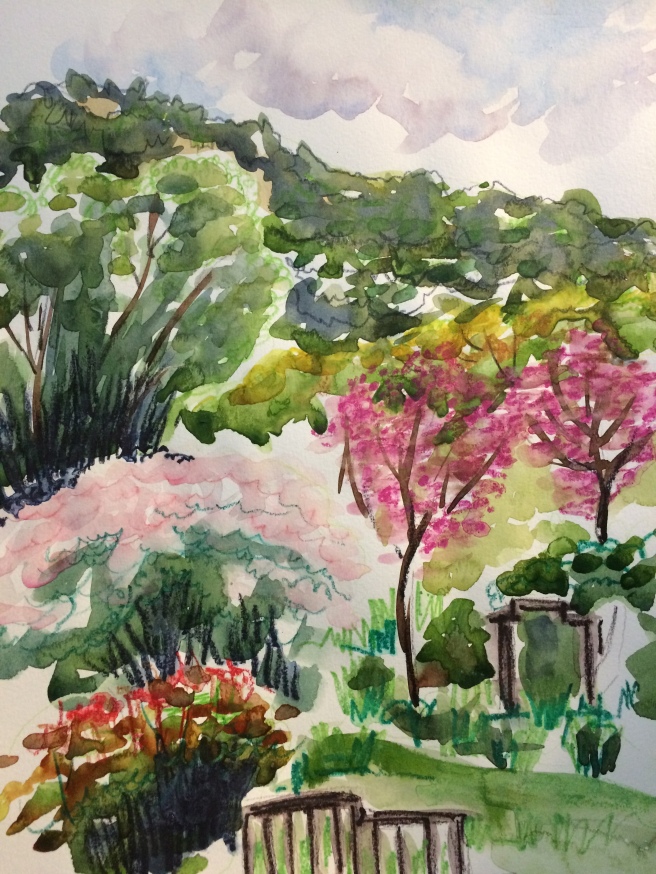
But my real intent was to use all of the red and pink colors in my watercolor cakes and tubes, as well as my watercolor pencils to render all of the flower petals and shiny new leaves in the rose garden that day. So, listed here are those colors and a few notes I made for each one I used:

Watercolors:

  • Chinese White

Small amounts of: Scarlet Lake, Cadmium Barium (red, medium), Cadmium red (light), mixed with sap green with some of these reds to make the trunks/branches of some trees

  • Alizarin Crimson (tube and cake): Blossoms mostly, but touched the sky as well
  • Opera


Watercolor pencils:

Inktense pencils: poppy red, fuschia

Staedtler watercolour pencils–#61, #23

I almost never use a color straight from the tube or in a cake; I just have to add a little something else to every pot of color I make. Not sure if any of you out there use colors just as they come, or if you are like me and just have to fiddle around to make the perfect color, or make the perfect allusion of a color. I thought it worth some thoughts and words about the making of a color like pink, as I think it can go so wrong very quickly. I am such a nut about my blues and greens, so of course I must obsess about pink as well. There are a couple ways I get “Descanso Garden pink.” I usually start with a diluted and pale red color so I can layer more pigment later if I want. I also like to leave white space around the pink as I think it brightens the color as though it’s a highlight. I also like to suggest intensity with spots of scribbled bright watercolor pencil. Sometimes I leave it raw and sometimes I soften and swirl it around with a dab of water. I did that on the blossoms of the two trees to the right and the new growth of the rose in the foreground.* I don’t often add white to my watercolors, let alone to any of my “go to” reds (pretty mad about alizarin crimson in watercolor and oil paints as well) to make pink. Not really sure why I hold back the white pigment (gouache in this case). I am willing to mix huge amounts of white to my oil paints, no problem. Somehow I am OK with that because they are all still oils, where watercolors (transparent) and gouache (opaque) are different. It always feels like I’m cheating or trying to cover up a mistake when I add white. I feel like I should be able to use the white color of the paper underneath or beside the pigment to lighten the load of such a color, not cover it up. For this piece I did mix some Chinese white with my diluted red to make the blossoms in the shrub in the middle. And I like it. I have one exception to my seemingly crazy rules of mixing paint and pink and that is the color “Opera.” I do use that one straight from the tube. I didn’t use it in all its glory here, but I did spread it around quite liberally when I painted a friend’s bougainvillea summer before last.

* I don’t usually identify plants in my work as the two trees on the right or the shrub in the middle. I usually get up and look at the printed name stakes staked under each plant I am drawing. I mean, that’s what I love about places like the Descanso Garden or Huntington Botanical Garden, they have markers with names under all roses, trees and shrubs. Don’t know why I didn’t go and look on that day. I will definitely do that the next time I’m there.

People don’t often stop by when I am working, and I am actually kind of glad to not be distracted. But on that day a man and woman walked slowly past as I had just finished my large watercolor primary and secondary washes and blobs of watercolor foliage on the paper. I was thinking of taking a break to eat half of my peanut butter sandwich. They were about 8 feet away and didn’t really stop, but slowed their pace a bit to comment on what I was painting. Both said they thought it nice, but the man went further and said I should consider stopping as it was done. Of course I was thinking, “What did he mean by that?” I had so many more plans to add color and detail with my watercolor pencils. But I waited till they were way out of range, stopped, and stood back about 8 feet to see if he was right. I usually do this at various times of each watercolor. At that distance I take off my glasses, imagining I am someone else, looking at my art through different eyes. It is always at about this time that I make a mental note of what areas seem to be working best and which need a bit more attention. And I have to say that even though I later added a bit more linear color and detail with my pencils, it really looks pretty much the same as before.

I have already mused and written about when an artist knows he or she is done with a piece of art. And I still have no idea how to tell when I am done. I just make myself stop. That sometimes coincides with running out of painting water and my starting to use my drinking water. On that day I had run out of painting water, decided I was done and began packing up. As I did so the on looker’s comments got thinking about how far away one must stand to really get the total impact of a painting? Of course I initially thought it shouldn’t really matter and should be up to the viewer. This is a free country, don’t I get to stand as close or as far away as I would like? (Assuming I haven’t gotten too close and a museum guard has come to escort me away…) So, I wondered about other painters and what they might consider the optimum distance one should stand when looking at one of their finished works. I mean, if you get too close to a Van Gogh, all you see is brush strokes. And while that is pretty wonderful to look at, I would imagine he wanted you back a few feet to get the full affect of one color next to another, so your brain can magically mix them together in your mind. And Monet’s water lilies take up whole walls and getting too close to one of those pieces just doesn’t have the impact of standing way back. And I am certain that more contemporary artists, like Jackson Pollack, really wanted you to stand a good distance away to get the full affect of his large abstract canvases. Maybe when a painter decides to do a large piece, they are kind of daring you to get too close, knowing full well you will be compelled as if by some great force to take several paces back. This can sometimes be a very frustrating and selfish trick the great artists play on us. For example, last winter (2016-2017) the Norton Simon had Van Gogh’s “Bedroom” on Loan from the Art Institute of Chicago. That happens to be a real favorite of mine and I went to see it on a Friday evening during that time. There were so many people trying to get a good view of it, that I never got a real good look at it. I wanted to look close at the brush strokes and then step back until I was at the optimum distance I am sure Van Gogh wanted me to stand. But inevitably someone would see this space I had created and walk right into it. I tried to pretend that it didn’t matter, look through them and hope that he or she would soon be gone. But of course someone else joined that person, and so on and so on, until I finally walked away. I tried several times to go back and look at it again, but it was always the same thing. How do you look past someone with a stroller, or two friends with two strollers? So unfair and frustrating!

I hope to someday see Leonardo’s “Mona Lisa” in the Louvre. But I think he has played the ultimate trick an artist can play on all of us because that one is so small. (I just looked it up and it’s 2′ 6″ x 1′ 9.”) It’s also behind bulletproof glass (can’t blame Leonardo for that), which probably means there is some kind of glare when looking at it from some angles. To really see that one you would probably need to start out pretty close and then move a bit to each side to get the perfect view of her smile. And what are the chances that anyone will get out of your way so you can actually do that? (Such a whiner, I know.) I decided that’s when it’s probably good to be rich and famous, so you can pay to have everyone moved out of the way to get a good look. Not that any of my little watercolors could compare with the Mona Lisa, but I like to create art that would get your attention from across the room. And I don’t want the viewer to be gypped with just one perfect viewing distance to get the true affect of one of my little landscapes. I try to have a little something for everyone in my little works at every angle, just like this one. So I add small details of lines and scribbles of color that you can’t actually see unless you get closer. So, if any of my art is ever hanging in the Norton Simon or at the Louvre you will be able to enjoy it from many different angles. Of course if it happens to be under bulletproof glass or there are just too many people with strollers, you are on your own!

May 19, 2018

wasp1
1. Wasp details, summer 1991 (ink on acetate)
wasp2
2. Wasp genitalia, summer 1991 (ink on tracing paper)

You are probably wondering what you are looking at exactly. Well, these are close up parts of solitary wasps from Papua, New Guinea. This is one of those times where the story behind the art is probably way more interesting and complete than the sketches you see here. In the summer of 1991 I worked at the California Academy of Sciences in Golden Gate Park and I did illustrations for a couple botanists and one entomologist who worked there. It’s kind of crazy as I have plenty of copies of finished plants and plant parts, but I could only find a few sketches of wasps. Not really sure why I have such scant bits of these ferocious bugs to remind me of that work, but I have some great stories about the people I met on the entomology floor of the Cal Academy.

So, now it’s time for the story about drawing wasp genitalia and I need to start with some kind of disclaimer or explanation. The entomologist I worked for at the Academy, and all of the people I got to know on both the entomology and botany floors, was amazing. My entomologist was so passionate about his studies of these solitary wasps from a far-away place. When I told my friends, and husband at the time, what I was doing there I was always met with a bit of a smirk or snort. Of course I don’t remember my husband at the time smiling about someone drawing wasp genitalia. He seemed to be more concerned with my possible deteriorating vision as a result of my looking back and forth at microscopic bug parts under a microscope (sometimes using an electron microscope) and then refocusing my eyes to look at a sheet of acetate where I inked in the lines of the wasp. He told me I should be getting more than 10 dollars an hour if I was going to go blind. Somehow, I just didn’t mind.

I thought all of it was so interesting. I loved the whole process I had to go through to complete just one final illustration. If this is all too odd for words, you have probably stopped reading. But if not, here’s how it went for each wasp I illustrated. First, the entomologist would prepare the genitalia bit he wanted me draw and placed it in a shallow dish of liquid (probably water). Then he placed it under the lens of a special projector that projected the specimen onto the wall of a windowless room that was lit only by light from the projector. Once he adjusted the picture on the wall to the size he wanted, I taped a small piece of tracing paper on that very spot. Then I used a pretty hard-leaded pencil to trace the structure and hairs you see in the second illustration. And once the sketch was done I then went into a well-lit room by a window and rendered the structure with a very fine point mechanical pen (.25 and .30 mm, that continuously clogged) on a sheet of acetate. Next, to add further detail to some “hair-like” strands of the lines I took a fine-pointed blade and scraped away some of the ink to make the lines go from thin to thick then back to thin again. “Lions and Tiger and Hairs, oh my!”

I guess the real question here is was it funny that I illustrated wasp genitalia, or was it funny that I enjoyed working really hard to make the best darn wasp genitalia I could? And I guess what’s really funny at this point in the story is that I assumed that each hairy little bug bit I illustrated was the actual wasp penis. But it isn’t! I never really asked him much about what I was drawing. And I only recently figured it all out when I looked it up online the other day—literally just the other day. Back then I knew that if you looked at the back end of these wasps, they looked different depending on the species. (I am guessing wasps didn’t need drawings to help them decide who was the male and who was the female.) But if you are a bug scientist, this is how you can tell one from another. I remember learning that you can look at wings or the head to also tell male from female. Look at the mandibles of that beast—at the very top of the bug hierarchy of predator bugs. Right? Are they afraid of you and you afraid of them? I’ve had them chase me…

From end to end I was fascinated with these wasps. But I was all wrong about their “back end” anatomy back then. It turns out that those hairy feather-like structures come in pairs and actually surround the penis on either side. So, I never did draw a wasp penis, just one side of the hairy outside covering. Who knew? I wonder why I didn’t wonder about it back then. Maybe the idea that this hairy feather like thing was a penis was kind of amusing to me. But I suspect the answer is even funnier than that. My entomologist had such passion for his work, but I was more interested in just making the best genitalia I could with no questions asked. I’m sure he would have explained it to me if I’d asked, but since I was on the clock it was all business the minute I walked into his office, with no time for explanations. Most of our conversations took place as I was starting a new specimen and when I came back from lunch. He frequently asked me then if I had had any caffeinated drinks, as he was concerned that my hand would be too shaky to draw. I guess the final part of this long winded disclaimer is that I never thought he was funny or ridiculous for studying such things. I got it. And he carried me along with his enthusiasm and I loved all the steps it took to get the final art of male wasp genitalia (penis coverings) from Papua New Guinea.

There were lots of reasons to snigger and smile that summer, I guess. Thinking back, probably the least funny bits were the actual wasp bits I was drawing, but I still smile when I think about some other characters I met on the entomology floor that summer. For example, one morning, as I walked down the hall behind one of the younger entomologists, he suddenly whipped around and presented me with a tiny box. It was a pair of copulating insects that had been captured, pinned and preserved in the act. Of course I was startled, but not as startled as he. He said, “Oh, sorry, I thought you were someone else.” Then as quickly as he had first turned to look at me, he turned back around and hurried on his way. I remember thinking then as now, who did he think I was? Pretty funny, right?

Another morning I rode up in the elevator with another entomologist that enjoyed describing something called a “Skipper”—a tiny butterfly-like creature. With a smile on his face and twinkle in his eye he told me that he had spent his career studying this particular insect. Once we got to our floor he asked me if I’d like to look at some of the Skippers he had collected, but I noticed he was a bit slow getting out of the door. As we walked to his office he told me that he was about to have knee replacement surgery. It seems that he had compromised his knee joints from years of crouching in fields and balancing heavy collection boxes on his thighs with bent knees. But once he had a collection box in his grasp he was transported to a field of skippers. And I was there along with him. As a little girl I remembered these tiny golden things flitting from flower in a neighbors back yard. Ah yes, I got it too.

Of course the people who studied spiders were also on the entomology floor. I had a few encounters with those folks. Somehow I remember one “spider-guy’s” office as being more sinister and dark. Glad he didn’t ask me to draw any spider bits. I probably would have done it, but it would have seemed like Halloween all the time. Was I really ready to go blind squinting at spider parts for 10 dollars an hour? Too much for me, I think.

But the final and not very funny story of it all was when I told my entomologist that I was leaving. He was truly sad. So, when I finished my work on my final afternoon on the entomology floor at the Academy, he took me to a local, and very wonderful pastry shop, for a cup of tea and lovely sweet. And of course at that point, he didn’t really care if I had had any caffeine, as it didn’t matter if my hand shook. We visited for a time—don’t remember what we talked about—and he dropped me off at the BART station and that was that. I never went back as a Cal Academy employee. All future visits have been as a visitor. I’m sure such art would be done with a computer these days. Once you’ve drawn one bit of genitalia on the computer it’s just a bit of maneuvering that would need to done to elongate/shorten parts or add hairs. No more clogged mechanical pens and scraping. Of course now I do need glasses to clearly see this screen, write these words and create my art. But I can’t really blame it on my time with my entomologist or the solitary wasps from Papua New Guinea. It’s all due to just the passing of time.

May 12, 2018

Gene Autry tree
Gene Autry Museum, summer 2017 (mixed media on watercolor paper, 9 x 12 inches)

The first piece of art is of a tree outside the Autry Museum in Griffith Park. (I’ll get to the row of fantasy flowers in a bit.) Griffith Park is kind of big deal around here. I just looked it up on Google and saw that it is over 4210 acres right here in the city of Los Angeles and it goes from an elevation of 384 up to 1625 feet above sea level. That space includes the Autry Museum of the American West, the Hollywood Sign, Greek Theatre, Griffith Observatory (La La Land and Rebel Without a Cause featured this location), the LA Zoo, and 70 miles of trails to hike on. And it’s very close to the Warner Brothers Studios (in Burbank) and Universal (in Universal City). I guess to say Griffin Park is a big deal is kind of an understatement! And all of this is very close to downtown Los Angeles.

One early cool morning, last July, I was wandering the grounds outside the Autry Museum of the American West and I saw this tree and felt compelled to capture the shade and coolness of the tree. It was kind of nice as I found a picnic bench nearby and I sat there and painted away until the heat of the day started drying out my pots of color too quickly. I filled up that paper with all that lovely cool blue, green and pink. I think it was just in my last blog that I wrote of “filling the page” or “filling the space” and I have been thinking a lot about that idea. And that idea really started the afternoon of Friday, April 20th, when I taught a class of 2nd graders how to use oil pastels.

In my real life I work with children at a couple schools. When a teacher at my elementary school saw/heard that I was a painter and had been an elementary school art teacher, she asked me if I would come in and show her students how to use oil pastels. When I walked in the door, they were ready for me–with butcher paper on the tables and each student wearing a smock to protect their clothes from this very non-kid friendly medium. I quickly put on my apron and began to describe the color wheel, with its primary and secondary colors, to this rapt audience. I’m never sure if kids are really listening to me at this point of a lesson, or if they are just dying to break out a cool new material and start drawing Spiderman, a car, a princess or something from a video game or movie. But I gave it my all and not only explained what the color wheel looked like, but how those 6 colors of pigment, plus white and black, are related to each other.

row of flowers
Made up row of flowers, summer 2017 (mixed media on 6 x 9 inch watercolor paper)

(Now would be a good time to look at this flower illustration for inspiration. But I should say that this piece is only vaguely like what I demonstrated for them that afternoon. Besides, these flowers came from my imagination and I was trying to get them to picture flowers they may have actually seen before.) Since it was spring I contrived to have them first draw a row of 3 flowers (tulip, daisy and hyacinth) on long stems coming up through a bit of grass.  And aside from telling them not to use black because it can make everything kind of smudged I didn’t say anything about filling the space, or filling the paper. I didn’t tell them to first arrange the paper like a window, not a door. I thought they would notice that I had done my sample drawing in a horizontal position, but a couple didn’t notice and placed their paper on the vertical (like a door). And that was fine with me. So, I passed out the oil pastels, encouraged them to see what happened if you layered one color on top of another on some scratch paper and scrubbed, or mixed, the different colors right on the paper. Then… Ready! Set! Go! As I walked around the room it was so fun to see that some had done the row of flowers near the bottom of the page, some in the middle and some floated the row of flowers near the top. Some drew large flowers that filled the space, while others drew a row of small flowers. So interesting to see if anyone would want to fill the space and add something else, or would they just stop with the flowers and grass? When I could see that some were adding the sun, clouds, butterflies and lots of grass, I encouraged them to do so. Some were focused on each flower and were actually trying to mix the oil pastels on the paper, while others kept the colors very distinct and pure. All of the art was smudged a bit (a definite downside to this medium, especially for children), but no one seemed to mind. All were busy bees and the room practically hummed with the energy from such a creative hive. The teacher had gotten a special shiny silver pen for each student to boldly sign his or her art. She also told me she would mount each piece on black paper, much like a frame. The teacher added that the art would be displayed in the classroom for Open House. (This is a “time honored” spring event where families are invited to come to school and view each student’s classroom. Our Open House will be Tuesday.) And when it was finally time to clean up, I looked around one last time. The diversity in their finished work was lovely to behold. Some had completely filled the page, some had not and a couple convinced me to let them try the black and it really added to the overall effect of their flowers. I explained that the only artist I thought got how to use black was Vincent Van Gogh. Not sure if anyone was listening by that time because they were pretty close to being done. (I was thinking of his “Wheatfield with Crows” as he just added that dark bit of black to the sky and the “flying crows” detail so effectively. But I didn’t want to go any further and scare the little kiddies as Van Gogh did that one at the end of his life. And I guess there is much speculation as to his state of mind by that time.) I asked the teacher if she wanted to tackle watercolor with her students before the school year was out. She just kind of looked at me, with that “Are you kidding expression?” and reminded me that Open House was coming and there would be much to do before then. She agreed to talk about it, but seemed relieved when I said we could do it next year, with a new batch of second grade artists. Actually, the middle of August would be a great time to talk about watercolor. It’s so hot here at that time, which would make it a perfect time to talk about that medium and the miracle of evaporation. Oh yeah, I have also been a science teacher. Remember the answer to this one? What are the three states of water? What do you know about ice, liquid water and water vapor? Wouldn’t watercolor be a complete disaster without evaporation? I mean, what’s the worst that could happen with watercolors at elementary school? Someone spills water on the floor? No problem. Everything dries out eventually, right? Stay tuned…

Further note about my row of flowers:

My aunt has a friend who lives in Seal Beach. Her friend is an amazing artist and has done a lot of painting. She enjoys using all kinds of media and in the past liked to paint on furniture. Very whimsical and pretty! My aunt told me that this friend invites people over to paint with her, and my aunt likes to join the group when she can. My aunt doesn’t think she is much of an artist, so she usually knits when they get together. Most times my aunt’s friend has some new kind of art material or project to try out for these get togethers. Some bring art they are working on and others try out whatever she’s got going. I happened to be visiting my aunt last summer when she went to Seal Beach to hang out with the group. I had a great time trying out some of her pens, doing the repetitive details you see here. It seems like the artists I meet these days are very interested in trying new materials or techniques. (One of my Urban Sketchers said something like, “We all just love to ‘geek out’ over new pens, brushes, watercolor colors, paper, techniques and general painting stuff.” That is so true!) As you can see, I really filled up that flower space. And when I ran out of the obvious white spaces I imagined other kinds of spaces and began layering more and more detail on top of everything. And I even added the dreaded black! Not really sure outlining everything with a great black ink pen counts as being as bold and brilliant as Van Gogh though. Oh well.

May 5, 2018

Earth Day 2018 art
Doris Japanese Garden, Kenneth Hahn State Recreation Area, April 21, 2018 (mixed media on watercolor paper)

I did this watercolor at a World Wide Sketch Crawl for Earth Day this year. I had never been to the Kenneth Hahn State Recreation Center and was a bit confused about where I was as I went past quite a few vacant lots with oil well pumps. (Random rows of oil well pumps in SoCal and parts of Central CA are pretty common sites. In fact, whole block areas of Long Beach are still loaded with oil well pumps. When my dad was a kid growing up in Long Beach he and his cousin used to climb the wooden derricks. His cousin thought it great fun to go to the bathroom while twenty feet off the ground. Yikes!) So, it was a bit disorienting to go past so many familiar CA sights in an unfamiliar part of Los Angeles. Finally, I started to see a few thickets of eucalyptus trees and fewer oil well pumps on the right side of the road. Then I saw the entrance, just as the GPS had predicted and my phone died. Since this was a new place for me it took a few minutes of walking around to find my little gang of LA Urban Sketchers. They were all gathered around this little bit of water and greenery and had already started to paint and sketch. So, as is usual for the urban sketchers I know (including me) we first walk around a bit to decide where we might like to settle and paint. I noticed that I didn’t see anything on this side of the pond that I wanted to capture and it looked cooler on the opposite side. So, I walked around. And there, I could see all these sketchers on the grass. I thought, I don’t often put people in my art and planned to immortalize everyone I saw on the spot—especially as I could clearly make out a couple painters I knew that were wearing large red hats. Adding those hats seemed like a lovely bit of unexpected color to accentuate sketchers on a patch of cool green and yellow. And I loved the idea that everyone sat very still, with no one moving around and doing strange things with his or her arms or legs. (I’m sure you’ve noticed that there aren’t any people in the finished piece. I tried. I did try. Oh well.) I sat at a bench in the shade and looked at a lovely little bit of water with bright red bridges, sloping grass with sketchers and rows of trees in the background with a tall stand of eucalyptus touching the sky at the very back. After a time, one of my friends across the way decided to move over to my side of the pond. She was one of the people who were wearing a large brimmed red hat. Uh-oh. I was now one stationery “red-hatted” person down. I quickly scribbled in the remaining people sitting on the grass, careful to include the other person still wearing her red hat. I then felt comfortable to focus on the rest of the composition, and started looking around. I watched a row of turtles at the edge of my side of the pond as they plopped into the water, one after another. I chased a couple of squirrels away from my peanut butter and jelly sandwich, mixed my pots of color and added the sky and tree layers. There was a rather large party of young people also at this pond. It was a young lady’s Quinceanera, or her fiesta de quince anos, and she was being followed around by her entourage and a photographer who was chronicling the event. A girl celebrates her Quinceanera when she turns 15. It’s a coming of age celebration that has its origins in Latin America, but is widely celebrated in both North and South America. Google it to see more. It is a very popular thing for a Los Angeles adolescent Latina to plan for and celebrate, so it’s a pretty big deal around here. There were about 8 boys who ranged in age from 5 or 6 to 13 or 14 years of age and they each wore matching charcoal-colored suits with pale pink ties. There were also about 5 young girls in fancy dress and long gowns, with assorted adults wandering around with the group as well. (I didn’t get an actual head count as they never stayed in one place long enough to do that.) At the center of all the commotion was a 15-year old girl in the midst of celebrating her Quinceanera, looking very much like a princess in her long “Cinderella-like” gown. I continued to watch the group move around the pond for photo opportunities and continued to add everything but the people to my watercolor. Can you tell that the wrong people had my attention? And you know where this is going, right?

So, by the time I got back to adding the sketchers in earnest, many of them had moved into the shade, or had moved behind bushes. What the heck! I began trying to ad lib the people I had previously scribbled in, trying to remember where they were and what they were doing. The only thing that stood out to me at this point was the remaining red hat. That was a mistake and it soon became too large for anyone’s head on that scale. My original plan to permanently add humans to my little world sort of deteriorated from there. I went to work scrubbing out everyone and the offending hat from the grass with a slightly wet brush. And just like that they were gone. The squirrels before me persisted, but I wasn’t about to put one of those pests in this piece.

It got to be time for us to get together and share what we had created, so I gathered up my materials and repacked my backpack. As I was walking around to the other side of the pond, a woman stopped me to ask what we were all doing. It turns out she was quite an artist and she showed me a couple photos of her work on her phone. She did these amazing close ups of flowers, kind of on the order of Georgia O’Keefe. She used such vibrant colors with a kind of fantastic realism. Not really sure if what she showed me jives with the Urban Sketcher mantra, but I suggested she join us anyway. She didn’t seem that interested, but was interested in my watercolor and said that she liked that I had “filled the page.” When doing a landscape like this, I can’t really help myself—I like to fill the page. (That might actually be a good subject for another time. Hmmm…) We said goodbye and I joined the gang to share our work. That part is always fun to me. Painting and writing are very singular endeavors. I think that’s why I like these events, it forces my rather shy self to get out there and mingle. It was amazing to see just what everyone had painted, as they were all kind of looking in the same direction at the same things—or so I thought. But everyone’s art looked completely different. Some painted in tiny tablets or books. Some did pen and ink on white paper, while someone else focused on the turtles using only graphite and white gouache on toned paper. We laid all the work on the ground and one of the artists set to work organizing each piece into a kind cohesive patchwork of art so a photo or two could be taken and get everyone’s in the shot. (She was pretty good at it and I thought she would probably be good to have around when it came time to load the dishwasher after Thanksgiving dinner.) Then one of the organizers of the group told us she was thinking of putting together a San Francisco Film Noire excursion this summer. She thought it would be fun to go to various haunts of Sam Spade in the Maltese Falcon (by Dashiell Hammett) to draw and eat. Sounds great, right? Of course I didn’t have the heart to tell her that the weather in San Francisco during the summer months can be cloudy and cold. (You may or may not know the best months to visit San Francisco. September and October are usually best.) But I wasn’t about to spoil the moment and decided that people would for sure be wearing hats and that would give me another great opportunity to add some sketchers to a watercolor.

A Parting Look at the Kenneth Hahn State Recreation Center

So, it was finally time to leave for home and I was wondering how my internal GPS was working as the battery in my phone needed to be recharged. I walked past a huge limo and was guessing that the Quincenara group was inside, ready to go to the next part of the celebration. I recently met a young lady who is a Quincenara choreographer (Yeah, you should Google this. It sounds pretty fun!) and I was guessing they were all about to go dancing. And based on the 3 or 4 year old girl who was having a melt down as she and her mom walked past (maybe more like on tip toe and screaming) this little one was not invited into the limo. But I imagine she will probably soon be planning her Quincenara. Of course she didn’t see it that way! She wanted to party, but probably really needed a nap! And even though Cinco de Mayo has absolutely nothing to do with young girl’s special party on a beautiful spring day in California, it somehow seems fitting to say Happy Cinco de Mayo because it is!