May 25, 2019

Jacaranda, 5:18
Jacaranda tree, Glendale, 5/18/19 (watercolor pencil, Inktense pencil on watercolor paper)

After I posted last week’s story of where art takes you I went on another “art” journey. And I went looking for jacaranda trees that are beginning to burst with impossibly bright purple flowers. I had seen quite a few when I was at the Mount St Mary’s University Doheny campus the day before. Mount St Mary’s is right near USC, the California Science Center and the Museum of Natural History. The tiny university is just two city blocks, but my my they had some lovely jacarandas blooming there. 

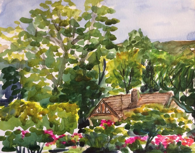
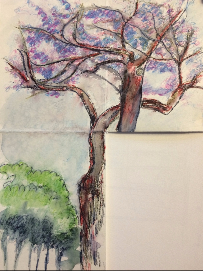
So the next day, I headed to where I knew some of these trees were blooming a little closer to home—in Glendale. And of course, this “art” journey became something of an all too familiar journey I had often done in this part of Glendale a couple years ago. So a quick sketch of a SoCal spring blooming jacaranda tree began an art gambol through the Glendale hills, where I greedily captured what I saw around me as I went. As I sat on my sheet of bubble wrap on the very cold concrete I formulated this plan of trying to capture several views as I walked along with my folded and cut watercolor paper, similar to the Sketchcrawl I wrote about April 27, 2019 on May 4, 2019. I must say that I was actually not inspired to sit there very long as every time I moved even the slightest bit I could hear the tiny bubbles pop that were trapped in the plastic. I knew it wasn’t going to be long before my posterior was sitting on  the cold concrete on a thin sheet of plastic, sans air bubbles of insulation. For this first one I wanted a kind vertical 3 rectangle sketch, emphasizing the expansive branches of the bright purple upper story, narrowing down on the left to the dark trunk of the jacaranda. (Isn’t that a great name? Jacarandas are not native to CA, like so many other flowering trees you can see down here, but comes from tropical and subtropical places in Mexico, Central and South America as well as islands in the Caribbean.) I was pretty excited about what I might see on my next stop, but kind of had the idea of going to the amazing pink stucco house that’s coming up next. I used walked past it on previous walks in this Glendale neighborhood. (See August 5, 2017 entry.)

Columbus, 5:18
Pink house on Columbus, 5/18/19 (pen and ink, watercolor pencil and Inktense pencil with watercolor crayon on watercolor paper)

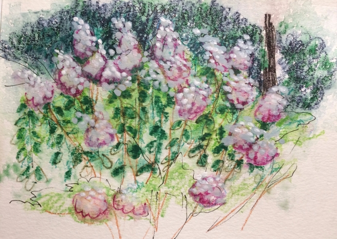
Because of this kind of journey, I didn’t want to wait for anything to dry, so I didn’t add water to any of these pieces until I got home. Once I had the jacaranda just where I wanted it, sans water, I started the climb up the hill to this view. I have walked past this house countless times, visited with the next door neighbors, watched a for sale sign go and then down. And now the newer owners have added a massive fountain next to the pink wall in front. So, I stopped and sketched what you see here, focusing on the new fountain. Birds were coming and going and I wanted to capture it, with its bubbling water, that had invited new life to the pink stucco house. For the shape of this image, I dropped open the bottom right vertical rectangle, below the jacaranda,  and went to work. I liked the idea of doing this as a small 4 by 6 vertical piece because if I folded up the jacaranda just right, the welcoming fountain could be the front of a card I might put in an envelope so I could send it to someone. I have to admit, I really cheated on this one as I only did a pen and ink while standing there, adding the color and water when I got home. If you have ever stood and sketched anything, you know that it’s a little tricky to add too many elements to the paper when you are standing, as you are shifting materials in and out of a bag or pocket with one hand while holding the pad of paper with the other. So, I was there just long enough to see a couple birds, get the basics down, take a photo and head further up the hill. I wanted to capture one more piece on the back of my cut and folded watercolor paper before I headed to a Coffee Bean for a lovely double shot cappuccino. 

Kenneth, 5:18
House on Kenneth, 5/18/19 (pen and ink, Inktense pencil and watercolor pencils on watercolor paper)

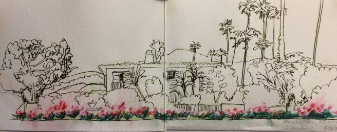
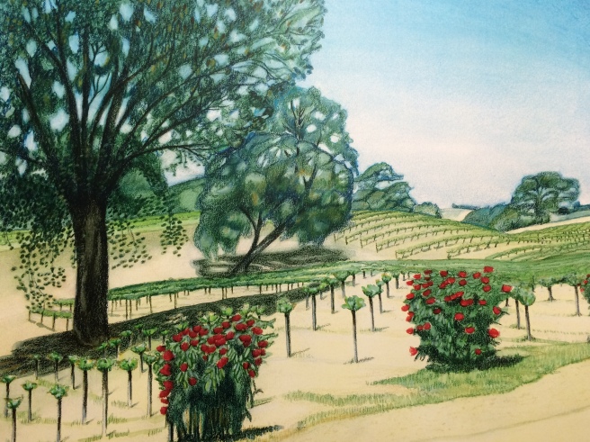
It was truly a strange event for me to even stop and really look at this house. I normally don’t walk past it on Kenneth. I’ve driven by it, but have never really taken a good look as I speed by. For my usual journey through this neighborhood of Spanish revival houses, I come down the hill past just the corner of this one. And I have walked past there countless times, wondering who had painted this Italian villa inspired stucco house a couple odd shades of pink and ochre. There was also a small addition being added to this side and I was distracted by that as well. Yes, you could see some flowers here and there, but there was just too much boring grass and I didn’t realize there were so many palm trees in and around the house and lot. But for this Glendale gambol I found myself walking past the front of the house on the other side of the street. I noticed the whole house had been painted a rather lovely cream color. It was at this point I really noticed the amazing rose garden that was in full bloom the entire expanse of the front. I kind of stopped and almost gasped at my previous lack of attention to all this loveliness. I knew I wanted this image. So, I folded my paper into a long horizontal view so I could capture this lovely Italian looking stucco house with fountain and roses that a were bursting with color all along the low wall. I had the whole backside of the jacaranda and pink house fountain watercolor paper to do it. Woo hoo!

Finally, I had constructed the perfect three-piece art of my Glendale gambol. And it was all inspired by a lovely jacaranda tree. I don’t really have anyone in mind to send it to, so I think I’ll keep it awhile to remind me to always look again at things we think we have already seen. I was glad I had gone on my art journey, back to a familiar place to discover something new. Maybe it was good to be gone so long because it was fun to see it again. Where would you go visit again if you could? It doesn’t have to be a fancy far away place, it could even be something, or somewhere, in your own California backyard. 

May 18, 2019

Descanso May 5
Rose Garden, Descanso May 5, 2019 (watercolor and Inktense pencil on watercolor paper)

Where does art take you?

On May 5th, my quest for art took me to the Descanso Gardens for a celebration of spring in the rose garden with some sketching friends. What a lovely quest for a lovely spring day. I wandered about around the edges of the rose garden and settled on a bench that was at the fence line and up slightly higher than the rest of that part of the garden. I thought this a good vantage point to look out over one entire side of flowers. There were roses of every size, shape, color and scent everywhere you looked. In fact, I thought it so great I imagined it was all mine. I imagined that I was looking at my little house nestled quite comfortably in the trees and flowers. It was fun to do this as I had forgotten how often in the past I had  projected myself into my landscapes so I could go wandering around there whenever I liked. Art can do that. It can transport you like a time machine that drops you into a wonderful place in the past as well as make you hover somewhere as long as you like in the now. 

My fantasy home you see here is actually the restrooms. But in my artistic mind I can walk right past them to a large nearby covered pavilion area. (They have weddings and receptions here.) I can imagine hanging a hammock or two from the massive beams in the ceiling there. (I say hammock or two because I may want to invite a fellow artist or friend to my fantasy.) There is a frig in this covered area directly in front of the restrooms (really). And in my fantasy garden I imagine that someone from a recent event has left some chilled champagne and maybe some yummy munchies for me and my guests. (Of course the food would need to be in the refrigerator too or I would surely have to fight off raccoons or skunks.)

Lilacs/Descanso Garden.jpg
Lilacs at the Descanso Garden, April 19, 2019 (Inktense pencils, watercolor pencils, ink, white acrylic on 6 by 9 watercolor paper)

I found myself at Descanso Gardens April 19th because I knew that the lilacs would be blooming. And my art quest for that day was to share those old fashioned flower clusters with someone who was getting over pneumonia and couldn’t come with me. So, I sent him a photo of the flowers and the art right there on the spot, as though he was sitting right next to me. Of course, he couldn’t actually smell the flowers, but he texted me back, saying that he was thankful for the art. Like I said, art can transport you to unimaginable places…

For example, the other day one of my students was wearing a t-shirt with a Storm Trooper on the front that was done in the style of Vincent Van Gogh’s Starry Night. I have to admit that such an artistic journey leaves me a bit confused, but it did make an impression on me. (You guessed it, the kid was more interested in the connection with Star Wars rather than Van Gogh.) But maybe the art that goes into a good movie is worthy of a journey. Not that Academy Awards are a measure of artistic merit, but in 1976 the first Star Wars movie won an Oscar for best visual effects.

Other movies come to my mind that had noteworthy artistic cinematography that transports you to another time and place. I recently saw “Roma,” and it won for best cinematography last year. It was such a beautiful story set in 1970-71 Mexico City that moved seamlessly from charming family vignettes all the way to important and huge crowds and street scenes. After a while I didn’t even notice that it was in black and white. And the cinematography Oscar for 1965 went to Dr. Zhivago (set in pre and post WWI Russia). I remember my mom and dad saying that when they sat in the theater, watching the movie, they felt so cold as the art of each scene moved them along with countless characters slogging through the snow. Mom said they had some friends that had said they were really hungry throughout the movie, watching the people wandering around without enough to eat. Such is the power of art that can take you to a place, even one that is not familiar to you. The Red Violin is a personal favorite of mine that won an Academy Award for the original score of that movie in 1998. Not only does the music carry you around the world in a more than 300 year journey with its hauntingly music, but it also tells a cracking good story that starts out in Italy and ends in Montreal. So yes, stories that resonate with you can be another kind of artistic journey.

Are you moved by lyrics to a song, prose in a sonnet, or prayers beneath a psalm? Is there music that takes you to a special place because the melody reminds of someone? How about Billie Holiday? The minute I hear her singing, I am immediately transported to a 1930s or 40s smoke filled jazz club where she is performing, even though I wasn’t even born yet. 

I am a novice when comes to really appreciating the art in architecture, but when I heard that Notre Dome was burning, it made me profoundly sad. How about you? I recently saw a story about a contemporary Danish architect, named Bjarke Ingels. And looking at his work makes me want to walk around in the artistic spaces he has created in not only his many projects in Denmark, but also structures he has created in Paris and New York City.

So what kind of art strikes at your heart strings? And where does it take you?

The Literal Artistic Journey of the Lilacs

Yes, this piece of art had a bit of a journey all its own. And the story begins with me deciding to send it to my son a week or so after I had painted it. I often send him a watercolor, pen and ink or random sketch through the mail. He had said he liked lilacs, so one day I sent it to him—with added postage I might add. I wanted to be sure it got there safely. Have you guessed that it didn’t arrive? You would be right. It took three weeks for him to find it. But it appears it had actually arrived in a timely manner. A postal person delivered it, but put it under the welcome mat outside his front door, without any bit of it showing or note explaining that it was under foot. My son only discovered it this week when the mat moved ever so slightly and a corner of the envelope was exposed. Yeah! It wasn’t really damaged, but it had been trod upon over and over for several weeks. I’m glad he found it, but I had already decided it was lost and wondered if it would be discovered in a hundred years in the basement in the midwest by the great grand daughter of a So Cal postal worker. 

Reminds me a bit of a supposed ledger that Vincent Van Gogh had sketched in, and it was discovered on a shelf the Netherlands in 2016. Who am I kidding? Of course this is nothing like that! However, it seems that maybe the journey of his art to the 21st century is a hoax. According to the Van Gogh Museum, the sketches were not done by him after all. But at least my 2019 lilacs were found. I was a little disappointed that it wouldn’t be found in someone’s basement in a hundred years…

May 11, 2019

Zenaida vineyards
Zenaida Cellars, Highway 46, spring 2003 (watercolor and colored pencil on cold press illustration board)

I had this watercolor framed for my aunt and gave it to her for Christmas. I can’t remember exactly which year, but I think it was December 2005. She has it hanging in the guest room of their house in Long Beach. I often stay in that room when I visit and don’t really notice it anymore. But the last time I was there, I stopped to look closely and found myself remembering a whole laundry list of things related to this very winery on Highway 46 that inspired the watercolor and this story. We lived in Paso Robles from the late 1990’s to August 2003 and my son, the dog and I frequently drove past this spot as we headed for the beach in Cayucos. I remember noticing the vineyard in the early 2000s and stopped to take photos that I used to create this painting. They had a great painterly looking sign out front of a kind of abstract vineyard with black, green and a kind of ochre I think. It was really creative and bold. Besides the sign, I was particularly intrigued with this vineyard because the grape plants hadn’t been in the ground very long. (If you look on the internet for the story of Zenaida it says that the land was part of a 100 plus year old homestead and the current winemaker started developing the land in 1998.) The plants were pretty vertical in shape as the branches hadn’t been tortured, tamed and trained to knit together sideways into what would become seemingly endless rows of thick green in the spring and summer. Then, of course, once the plants matured, the lovely fruit would come on with the lovely wine that comes from that fruit. Back then you could see the soil in between each plant. And the red roses at the ends of each row seemed just as distinctive and important as the pending cash crop. Nothing needs to be added here regarding the beautiful oak trees on that property because if you have read any of my previous blogs, you would know I am obsessed and besotted with oaks. 

As I continued to study this painting my thoughts of this place continued on. We had left Paso Robles by August 2003, but there was quite an earthquake in Paso that December and Zenaida had a bit of damage. A periodical from the time said that they lost about 6 barrels of wine and a 2500 gallon stainless steel tank sprung a leak! Yikes. I knew another winemaker who said that after everything stopped shaking he drove around to see how everyone had faired. It seems others lost product as well. Unfortunately, the building that housed York Mountain Winery had considerable damage after the quake and it was soon condemned. Once the thoughts of that place and time in my life had drifted away from me, I stepped in even closer to really take a look at the paper and pigment. During those years I was obsessed with local landscapes where I used Prismacolor colored pencils and watercolor on my beautiful Strathmore cold press illustration board. The pencils left a kind of pebbly look, that I smoothed out in certain places with light layers of watercolor washes. I remember that I was obsessed with the texture of the illustration board and began wondering if I still had a few pieces that I could resurrect. And then, as quickly as my attention was initially drawn to the painting, I looked away again and walked out of the room, briefly thinking about where I might find pieces of that board in my stash of paper. Such is the fickle and fleeting nature of one CA girl artist.

And all of that was completely forgotten until I stopped at the Southwest Museum Gold Line Metro station on April 20th, when I was participating in the 63rd WW Sketchcrawl. I stepped off that train at that stop and immediately saw a hillside of solar panels that reminded me of Zenaida’s fledgling grape plants that I had seen and painted 16 “springs” ago. Funny how things seem to come together like that. Do you have such “ah ha” moments?  I happily did that sketch (posted on 4/27), channeling the Zenaida Vineyards from spring 2003. I vowed to look for a copy of that art when I got home. (When I first started painting in Paso Robles there was a guy in my neighborhood who had converted the back of his house into a photography studio. He photographed all of my canvases. As for my watercolors I used a printer on Spring Street—Poor Richard’s Press—for my copies of finished art. And when color copy machines got better, I made the color copies myself. I knew I should have a copy of the Zenaida vineyards that Poor Richard’s had made me, circa 2003, somewhere. Now I just take a picture of my art with my phone.) As you can see here, I found one. Funny, I didn’t think to look for illustration board at the same time I was hunting for the “old” Zenaida. I guess I will just have to wait for another moment of madness or obsession to hunt down any of that paper. 

Anyway, once I had decided I was going to write about the Zenaida Vineyards, and Highway 46, as I remembered it in 2003, I wanted to include a photo of their great “painterly” sign. When I looked them up on the internet I realized that they were somehow now called Zenaida Cellars. I thought that OK because in 2003 I don’t think there was a tasting room as yet because they didn’t have any product to taste and then sell. But guess what? They have changed their logo and now there is no sign of that sign anywhere on the internet. Now they have a giant Z for Zenaida instead of that wonderfully colorful sign that signaled the beginning of our journey to the beach and reminded me on my return trip that we were almost to 101 and home again. As you might imagine, I obsessed over finding just one picture of that sign, but found nothing. I should probably contact them directly to see if there was an image of it somewhere about.

I have calmed down since my first manic attack of looking for and finding a copy of this art, but not a picture of the original Zenaida sign. I have calmed down because I decided I should be glad that I stopped to take another look at this watercolor that had reminded me of so much. In the past I have written about the changes I have seen in my California, and I have tried hard not to lament over things I could not change. I mean, who really cares about that stupid sign. Right? This whole line of sign thinking reminds me of some other signs from that time and place. In the early 2000s I did a couple hand stenciled red and white signs for Linne Calodo, which is down the road from Zenaida on Vineyard Drive. Back then their tasting room didn’t even open onto Vineyard Drive, but was actually on Oakdale Drive. It was just a tasting room and some left over cattle fencing from an earlier time. I wonder what happened to those signs? All and all I have photos and art of both vineyards before they grew up and that’s pretty great. I’m glad I saw that area when the hills were still covered with golden safflower, deep pink vetch and just dirt brown nothingness. I’m glad I saw those hills before the Central Coast winery obsession surpassed the farmland it covered over in more ways than one. Thank God the oaks are still there. As I have said before, if those trees were gone, that would be a change I’m not sure I could handle.

May 4, 2019

Walking Man3
South Pasadena Gold Line Metro Station with public art “Astride-Aside”, 4/27/2019 (ink and colored pencil on Bristol Board)

You may have noticed that there are two connected sketches here, one on top of the other. For last week’s post I promised to record the fifth and final stop of our band of sketchers contribution to Sketchcrawl 63 on April 20th. (Even though I don’t think it actually counts for the actual Sketchcrawl.) And here is way more than I had originally planned. After participating in that very fun event I was so taken with the idea of speedily sketching everything you see in a given time on a given day that I started imagining how I could make such an endeavor a little more special the next time I was so inclined to chronicle places One CA Girl might go. So, I started thinking of how to present the day’s work in a slightly special way. Maybe I could start with the paper I use. I chose a couple different kinds, each 9 by 12 inches, and I folded and cut each sheet into the different rectangular sections you see here. I planned to take these ready made sketching windows with me to sketch at the South Pasadena Gold Line Metro station on the 27th. I was intrigued to see if having such ready made sketching windows would inspire different views for my work. Maybe something would be suited for a small rectangle? Or maybe a long narrow space would inspire a different idea for a sketch? And of course the rectangles I saw in my imagination could be in either portrait or landscape positions, it all depended on what looked best to me on the spot. And sure enough, when I sat down on the bench next to “The Walking Man” (it’s actually called Astride-Aside) I knew I wanted the long narrow rectangle (in landscape position) for the pen and ink view you see at the bottom. I thought that shape captured all of the hustle bustle of a busy train station with this sort of large bronze man barging through the station and across the street. I was now set to draw many more views from the South Pasadena Gold Line station, all I had to do was fold the paper into the rectangular shape I wanted. This particular station is a pretty lively place—with lots of trains coming and going, assorted bike riders and cars passing through the nearby intersection. A nearby parked car had a car alarm that went off every time a northbound train stopped at the station. But everyone kept moving around and no one came to silence his or her car. Just another busy Sunday noontime in South Pasadena.

A bit of nitty gritty arty information about the paper I used…if you’re interested…

As I said, I prepared and cut up two different kinds so paper. This is Bristol board, a good paper for ink and colored pencil as it has a smooth finish. In my experience it is not generally good for a wet medium. (It’s made by Strathmore and it says on the tablet cover that it’s “ideal” for airbrush experimentation—who knew?) I also similarly folded and cut 9 by 12 inch cold press watercolor paper. I had brought my watercolor and Inktense pencils in case I wanted to get the paper wet later. (It’s made by Canson and the outside tablet cover says it has a “durable” surface—sounds like a great kind of paper for an urban sketcher.) Once I decided on the long narrow view of Astride-Aside, I used a couple clips to hold the Bristol board in the horizontal position on the sturdy cardboard backing of a drawing pad I had also brought along. 

Walking Man2
“Astride-Aside” public art (2003), South Pasadena

I thought you might like to see what the bronze statue actually looked like from a different angle. The whole statue is made up of bands of bronze that look like they have been stretched and woven together over a larger than life form of a walking person and then welded in place. It kind of made me think of making a paper mache shape with a balloon form underneath. If you have never done this kind paper mache it’s kind of a mess, so do it outside.  First you blow up a balloon. Then you cover it with strips of paper that have been dragged through a wet and gluey mixture (flour and water). Then, once the paper strips have dried and hardened into place, you pop the balloon with a pin. And you should then have a great orb shape that is hollow to make into a huge Easter egg, a mask, or anything else you think could go on your head. (Of course, for the Astride-Aside man, I am guess there were no balloons used with hot strips of welded together pieces of bronze.) But I still kind of like the idea of the artist first making a model with balloons and paper mache…This has probably gone far enough, right?

Walking man1
Views from bench beside the public art at South Pasadena Metro Gold Line station, 4/27/2019 (ink, colored pencil and graphite on Bristol Board)

Here are the other vignettes I did from the same bench. The top one is of a clocktower with lovely greenery below. I think this view fascinated me because the clock was working, but the time was way off. I was trying to think of some clever reason for this clock. Was it meant to art rather than a time piece? I mean, there is some kind of irony in having a clock with the wrong time at a train station, yes?

The bottom pencil sketch, just to the right of the strange clock tower, had a nice plaque that told all about what you and I are looking at with this sketch. And here is what the plaque says of this South Pasadena Landmark: “Watering Trough” —Erected in 1906 by Woman’s Improvement Association as a rest stop for horses and men as they traveled between Los Angeles and Pasadena. Restored by Woman’s Club of South Pasadena Jrs. 1968.” (Oh, and I wrote all this information right on my handy dandy Sketching Card, another great use for this little piece of art.)

I think this little vignette is pretty cool. You can’t see it, but under the roof behind the pile of rocks is an area where a large stone trough was constructed. It’s filled in with concrete now, but it doesn’t take much imagination to imagine a horse drinking from that water-filled trough as the rider sat nearby in the shade. There’s a huge and beautiful oak nearby that I’m sure added to the comfort of this tiny oasis. (Note from me: I wonder who was in charge of filling the trough? Someone from the the Woman’s Improvement Association? Also, do you wonder like I do, why the group was called a Woman’s Improvement Association? And there appeared to be a similar club of  Junior “Woman’s” in 1968. Just wondering…

So, when I was all done, I had three quick sketches that I had completed while sitting on a bench in South Pasadena. I turned the art over in my hands and realized I might have something special here. Not only did I sketch things, but I added notes. Between today’s stories and the art, I think I really did what Enrique Casarosa suggested on his Sketchcrawl website—to draw or record what’s around you in a few hours, a day or whatever time frame you have to spare. Maybe this could work as a kind of card you send to someone. When completely folded it’s 4.5 by 6 inches and should fit nicely in an envelope. I send a lot of my sketches/watercolors to my son this way. And as long as I take a picture of the art I made, I don’t really need to keep it all. You could send it to someone with a note like…Greetings from South Pasadena…Thinking of you…Wish you were here…Look what I did today…If kids had to make such a little card at school every now and then, describing what he or she did at school on a given day, then parents wouldn’t have to anticipate a non-answer to the question, “What did you do at school today?” Almost anything’s better than having your kid say, “Nothing.” Right? 

Happy Birthday Michael, 5/4 at 10:42PM