January 30, 2021

Virtual trip to Newfoundland, 1/10/21 (Water soluble red ink with Fude nib and Inktense pencils on watercolor paper)

Of course my virtual visits to far away places did not stop while I toiled away on my many Descanso Gardens winter solstice 2020 pastels. On Sunday morning, January 10, 2021, I was whisked away to far away Newfoundland with 30 of my favorite virtual online traveling sketchers. As was our usual for such an event the choice of place was left up to one of our members. And as is our usual, when someone chooses a place it’s to be somewhere he or she has been. It is also best practice that the photos we sketch from were taken by the host. Every now and then someone shares “stock” pictures that we in turn sketch. But when using such photos (probably taken by a professional photographer) you are never to proclaim you actually created the art as you are tapping into another person’s creative vision captured in their photo. It all comes down to awareness, as none of the “virtual travel” pieces I share with you are published or sold. They are meant to transport me to a fantastic place, where our host tells us about his or her visit there. It’s nothing more than that and not meant as a finished piece of art to be sold. It’s just meant to be quick bits of practice, as well as events my friends and I can do together to keep the artistic juices flowing during “lockdown.” It’s also to keep us from going mad with the incessant sameness of it all. 

This is actually my second sketch of that mornings journey to Newfoundland. It was especially fun to plan and execute this one. Our tour guide described this as an abandoned dock, a relic of an earlier time when such buildings were in constant use for the local fishing trade. What was most interesting to me was that the structure appeared to be made completely of wood, including the wooden pilings that supported it all. To me, that would seem like a very temporary set up, as the submerged wood would be difficult to maintain, right? It reminded me of old piers I saw on our CA coast when I was little. Today, such wooden piers out here are pretty much a thing of the past, with the wood having been replaced by concrete and steel. Over time the pounding salty surf from Pacific Ocean storms, full of punishing water and wind, inevitably wore away probably all CA piers, even those made with the biggest center cut redwood timbers imaginable. Of course the Newfoundland waterway seen here appear much calmer than our thrashing CA coastline. I think our host said she was in Newfoundland in April. Maybe the winter storms you might associate with such a northerly North American location was over for the season. Someone in our group remarked that the buildings of Venice were constructed on wooden pilings as well. I guess I could imagine the city may have been originally built with wooden pilings, but I couldn’t believe you would find such underpinnings today. Surely all of that wood has been replaced with something else, right? I looked it up and sure enough Venice was built on wooden pilings. And it seems there are still some 1000 year old buildings with the original wood underneath. Of course Venice is sinking, but it started sinking right after it was first established. According to what I found online it’s the weight of everything pressing down into the wet soil (mud) underneath that’s causing the sinking, and the integrity or wear of the underwater wood really had nothing to do with this phenomenon. Still hard for me believe…

As you may have guessed I was fascinated with all the wood I saw in this image. I set about to challenge myself by rendering the wood, and virtually everything else you see here, with one continuous line of water soluble “oxblood” ink. As I noted in the caption, the only other inked lines I added were surrounding the greenish bits of moss/kelp/rocks just above the walkway and to the right, below the walkway. 

Descanso Gardens scribble sketch, 1/9/21 (Red water soluble ink with Fude nib, Inktense pencils on watercolor paper)

Not sure I made a conscious decision to use a similar palette and technique the day before we went on our virtual journey. But sure enough, I remember being interested in the weathered wood of a pergola and bit of fencing I saw in the rose garden. Of course, for this one, I was actually at the Descanso Gardens for this “realtime” rendering. It was such a lovely Saturday morning to sit and sketch.

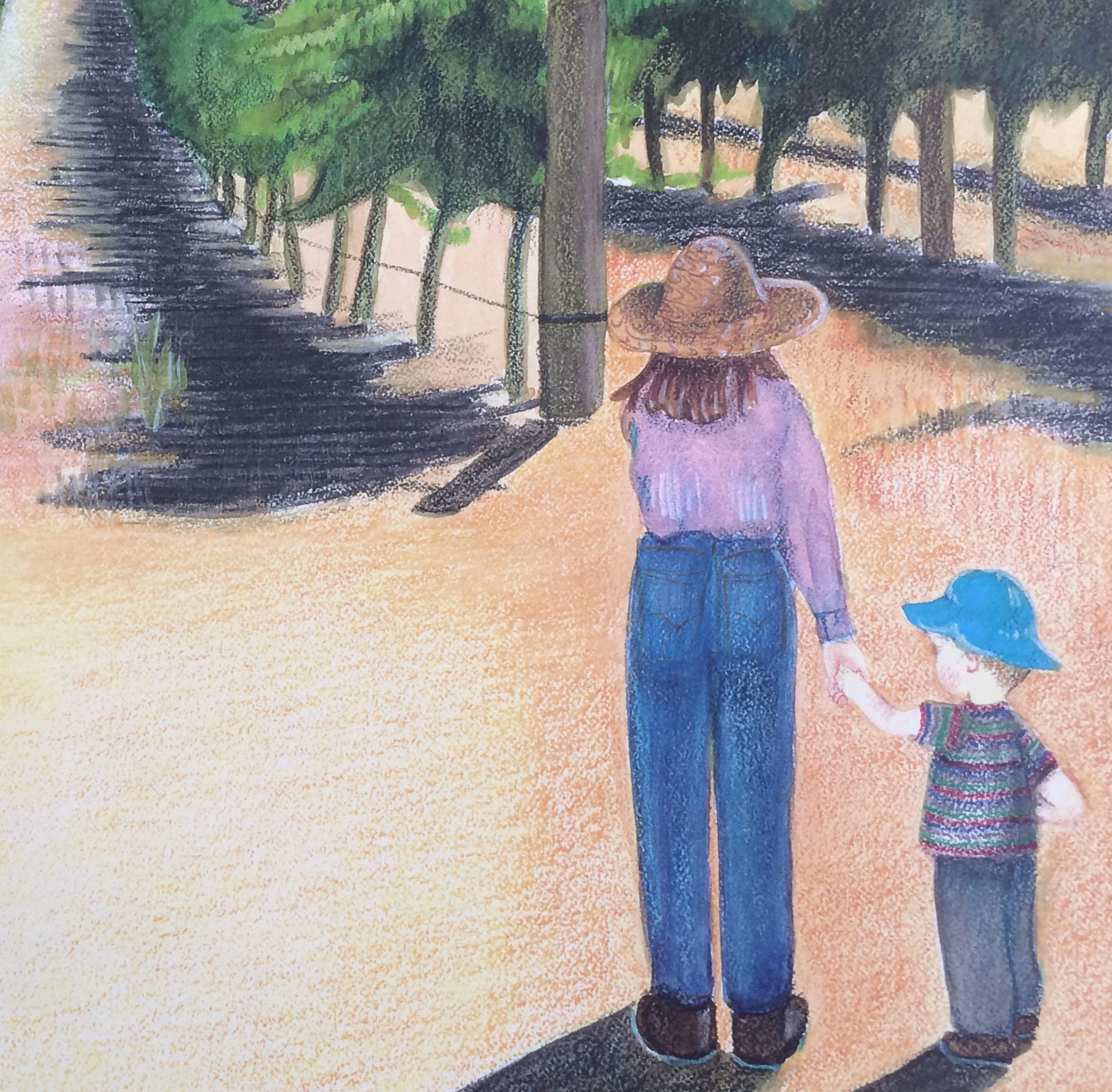
Virtual trip to Newfoundland, 1/10/21 (Black ink and Inktense pencils on watercolor paper)

I thought I might also share the first sketch I did on our tour. It was not done with any particular intent or choice of materials. Funny, but this image reminded me that I had already been on a virtual trip to Newfoundland. And I had taken that particular journey years ago when I read “The Shipping News” by Annie Proulx. It’s quite an amazing story, with some very difficult themes, but nonetheless a wonderful book I would heartily recommend. Ms. Proulx shared with the reader a Newfoundland that had some calm days, but there were also many days of incomprehensibly stormy weather.

Finally, I mentioned that we were expecting some rain here in CA. And boy howdy did we get some rain last week. In fact, the winter storm wind and rain washed away part of Highway 1 in Big Sur. As I said, our CA Pacific coastline can have some serious wind and wave action that can not only take down a substantial wooden pier, but it can also break up concrete and wash it away. And even though my garden and I are glad of the rain, it’s nice to have a break from all the lashing and thrashing for now. Hope you and your weather are fairing well on this winter day as well.

January 23, 2021

Winter Solstice 2020-2021, the fourth, Descanso Gardens (crayon pastels on Australian grey toned pastel paper)

Sketch of third winter solstice tree (see 1/15/2021) from a different angle (pen and ink with Intense pencils and water on mix media paper)

Up until yesterday it just hadn’t felt much like winter here, but this is one CA girl’s final homage to the winter solstice SoCal style. It’s kind of crazy, but just the other day it was almost 90 degrees outside my house. (For those of you in a polar vortex winter, I am truly sorry.) We’ve had almost no rain this winter and believe it or not, beautiful sunny weather can actually be kind of a worry and not really that wonderful. You might think you’d like to trade weather with us, well OK. All that heat without sufficient moisture can easily lead to a fire. It seems to me that each US region has its uniquely wonderful weather stories, as well as horrendous naturally disastrous weather. It also seems we are all experiencing unseasonal temperatures that feels like global warming to me. And to add to our already SoCal tinder box we had hours and hours of wind last Wednesday. In the early hours of that morning I heard not only the wind whipping around my house and trees, but also the sound of nearby fire/paramedic sirens four separate times. We had similar dry and windy weather last year and that lead to devastating fires here. (You may have read about it.) I don’t think I could stand that again. We were all indoors because of COVID, but weren’t really safe inside our homes either as smoke from the fires crept into our houses every time we opened the front door, even just to get the mail or take out the trash. Maybe all my weather worries are wrapped up with my hopes for better 2021 times. What about you?

The pastel close up of the specimen sycamore tree from the Descanso was an interesting challenge that unintentionally arose from the pinkish “under” color I chose. It’s actually called Australian Grey, but it really looks pink to me. In fact, that’s why I chose it. I was interested to see specifically how it would handle the yellow leaves and cobalt blue sky I layered on top. I had also hoped that the rosy hue would help me render the bark of the tree. Sycamore bark has a kind of scabby appearance, in my opinion. In fact, I am not really sure what I think of this tree in general. I mean, this specimen at the Descanso Gardens is huge and quite lovely, but I have seen sycamores that are giant and rather unattractive. I spoke with a “real” gardener a number of years ago and she said that it wasn’t her favorite either. And I guess that those in the “know” say it gets all kinds of diseases and is referred to as a “sick a more.”

Speaking of sick trees, I think my CA pepper tree (see 11/7/2020 post) that blew down in our last wind storm was probably not really very healthy. Maybe some of you already might have suspected that a healthy tree should not just drop huge branches, or completely uproot and fall over whatever kind of wind is blowing. Now that the tree is gone, I am wondering what to do with that spot. I do enjoy being able to see the hills, and was able to easily view the recent jupiter and saturn conjunction. But I think the birds and squirrels would enjoy another tree. First, I am going to try to “beef up” that soil by planting a cover crop that will hopefully add extra nitrogen in the soil. In past springs I have been delighted with the sight of fields of a cover crop known as crimson clover. The flowers are really quite fun—bright little fuzzy red spears and all. I ordered some seed, as well as “clover inoculant” to help ensure the soil would really be improved. I treated the seeds with the inoculant and planted them last weekend. As the weather was unseasonably dry I tried to keep the ground damp so the seeds would germinate and then hopefully grow. When I looked at the patch of ground after the Wednesday winds, it looked like a lot of the top soil I had added had blown away. I was pretty disheartened and wondered if anything would come up. When I looked again on Thursday I could see tiny crimson clover seedlings pushing through the dirt. I was ecstatic. I ringed the area with a tacky temporary fence to keep people from walking in there. (Of course you have to look hard to see anything growing, so maybe I just wanted to draw attention to my “idea” of spring flowers in a garden even though it looks like there’s nothing there.) But my best winter news from a patch of SoCal garden is that it rained last night and it is raining right now. Winter is finally here. Hallelujah! 

We did have some sad news this week. My son’s other grandmother passed away on Wednesday. She loved flowers (especially dianthus) and vine ripened tomatoes. When she spoke to my son over the summer she often asked about what was growing in my garden, and was keenly interested in the progress of the milkweed and monarch butterflies. His grandma always had dianthus growing in her raised beds. I think this year I will tuck some dianthus seeds into my garden as well. She would be glad to hear I had done that and would want regular updates on their progress. I know my son will miss telling her about them.

January 9, 2021

Winter Solstice 2020-2021, the second, Descanso Gardens (crayon pastels on burgundy toned pastel paper)

Here is my second attempt to capture the 2020-2021 winter solstice at the Descanso Gardens here in So Cal. Last week I shared a pastel on toned paper of a huge and lovely gingko tree just outside Descanso’s rose garden. This week I rendered a large and lovely sycamore tree with overhanging pink bougainvillea next to an opulent display of bright yellow tubular flowers that were clinging to a brugmansia shrub. I know we of Southern CA are spoiled with mild weather right now and are still enjoying such amazing color in many of our gardens. In fact, I was in the rose garden this morning and there were still quite a number of roses in bloom. And right now, under the canopy of the garden’s magnificently huge oaks, are numerous camellia shrubs with numerous buds all along their branches. (Camellias generally bloom in February all over Northern and Southern CA.) If you are familiar with Southern CA you may have already noticed another tell tale sign of where you are. It’s the white washed Spanish style stucco posts with rustic wooden arbor holding up the masses of flowers, right? 

This week I again used my crayon pastels on toned pastel paper. For this piece the background color I chose was decidedly darker—a deep burgundy color. I don’t think I’ve said why I generally don’t use “chalk-like” oil pastels. It’s kind of a simple reason really. Regular pastels are a messy medium, with lots of dust floating around as you blend one color into another. Using a “crayon” pastel doesn’t produce any dust I can see and that’s good, I think. However, because they are not so soft and squishy I have almost no way to easily blend colors. I can use my finger tips to scrub colors together. But that’s it, and it’s pretty limiting. I have to press so hard it almost seems I am also blending in skin cells and my fingerprints onto that rough and toothy paper. Adding human skin to a sketch is a little creepy, right? Many years ago I used pastel dust to create some of my scientific illustrations, but that involved frequent use of a spray fixative. Dust and chemical spray, yikes! Even though each kind of pastel has its drawbacks, I still love the lovely soft quality of color you can get. So, I guess I will continue using the crayon version for now.

But I wonder if the real story of my recent winter solstice pastels is not the medium I choose to scribble with, but rather the “under” color story which comes from the actual toned paper. I’ve written about using this “under” color technique in a previous blog, but what I described was related to working with oil paint on canvas or birch. For those pieces I first put down a color that is not meant to be seen, but it is meant to positively affect another color that will be added on top. For example, I might first put down a soft pink in the area of the sky, with the intent of that showing through in the tiniest way after I add just right amount of cerulean and white on top. This would then represent one CA girl’s sky just before sunset. Or I might use a bright cadmium red “under” color for a hill that will later be covered in vineyards. I think the “under” red sharpens and intensifies the shades of green that is then layered on top. I have also used yellow ochre as an “under” color for a variety of greenery, adding just a bit of an earth tone effect. As for this series of pastels I don’t need to lay down a color, the paper comes in these luscious “under” colors that I just need to choose from. But it also means that I need to be aware of how I will use that color for everything—sky, structures, as well as any plants or animals I plan to add. There is an added bonus, or consideration, with this approach as I can use the darker background color to create instant shading. All of this is very strategic, but I love this kind of planning. I absolutely love imagining all the different ways to achieve what I want even before I put one color on the paper. 

OK, you’ve probably had enough of my artist geekiness. But wait, I have a couple more 2020-2021 winter solstice pastels to share. Maybe for the next one I will just post the art, no explanation needed? Not likely!

Happy New Year! (I forgot to say that last week.)

January 1, 2021

Gingko Tree at the Descanso Gardens, 12/21/2020 (crayon pastels on “soft umber” toned pastel paper)

I ordered a set of POSCA pens a while back and proceeded to go insane with plans to use them. If you have been following my blog you will see definite recent evidence of my obsession. From the outset I knew I would also want to use toned paper with these miracle markers. I first began experimenting with a kind of line work on some grey toned paper I had on hand (see 11/15/2020 and 12/19/2020 posts). But I soon realized this paper was pretty limiting and it would only be a stepping off place for my desired “texture driven” sketches on toned paper. I began looking online for different colors and ordered a packet of “warm toned” pastel and multi-media artists’ paper. It seemed perfect for any medium, even the POSCA markers. The packets of paper were advertised as either collections of cool or warm tones. The warm tones I chose included: sand, rich beige, Australian grey, soft umber, raw sienna, burgundy, aubergine, olive green, burnt umber and terra cotta. But as you may have already guessed, the acid free archival paper is not meant for all media. I should have realized that when something was described as tough and toothy it would not make a great surface for the felt-like tips of my pens. The pen tips would have been shredded in no time at all. Of course, right? Once I realized my mistake I ordered some smooth vellum finished black card stock and once that arrived I gleefully went to work with my POSCA markers (see 12/25/2020 and 11/28/2020 posts).

Initially I was annoyed with myself that I now had all this lovely “warm toned” pastel paper without any purpose. However, it didn’t take me long to find a lovely use for it. It came to me when my Urban Sketchers group got together on the 20th and I saw that one of my buddies had done a stunning watercolor of a gingko tree at the Descanso Gardens to mark winter solstice 2020. (She presented this lovely piece of finished holiday art while I obsessively sketched Santa and reindeer in a cartoon car…) I let that pass, but an idea just kind of went “ping” in my head. I knew I wanted to maybe do a pastel of a gingko tree. Without realizing it, my friend also helped me act quickly to make this happen as the very ephemeral deciduous leaves of the gingko tree can easily blow off the branches this time of year. So, I went over there the first day of my winter vacation, which happened to be the 21st, the official day of winter solstice. As I have been to the Descanso so many times I knew exactly where “her” tree was located. Sure enough, the minute I got near it, I knew this was the one. And as I began to sketch the tree in situ an even greater idea came to me. I knew I wanted to render more Descanso trees on pastel paper as a kind of homage to the first day of winter and the promise of more hours of sun over the next few months. So I took a photo of this glorious gingko and several other lovely golden sycamore trees with plans to render at least three more 2020 winter solstice pastels from the Descanso Gardens. (Good thing I went when I did as we’ve since had some very windy days, with a winter thunder and lightning storm that brought buckets of hail on Monday, 12/28. I was at the Descanso on the 30th and there were very few leaves on this epic tree.)

If you have never seen a gingko tree, it’s kind of worth it to try to locate one in the flesh someday. The autumn/winter leaves are a spectacular shade of yellow. I would guess the actual color to be close to a cadmium yellow, light hue. (The rest of the year the leaves are a very summery shade of light green.) If you find a really old and tall specimen in the fall you will be treated to a shock of countless small fan shaped leaves. And if the weather has just the right amount of wind you will also be treated to an amazing display of yellow confetti all around. Seeing the tree at the Descanso reminded me of a time I helped fabricate plant material for the Life Through Time exhibit at the Academy of Sciences in the late 80s and early 90s. One of the trees we replicated was a full size gingko tree. It seems that the gingko tree is a very old genus and there are fossils of that plant that go back 200 million years. It is believed that dinosaurs like the supersaurs and lambeosaurus (a kind of hadrosaur) ate the plant. We hand painted each tiny yellow gingko leaf that was later affixed to fabricated tree branches. It was quite fun as we were instructed to not only paint the leaves yellow, but occasionally create interest on a random leaf or two with hand-painted bug bites. It actually became a kind of competition to see who could make the most realistic bug bites—what a riot! With the recent remodeling of the CAL Academy that tree and all the other plants I helped fabricate are now gone. I sometimes wonder what happened to all that fake foliage and wish I had one of the prehistoric leaves I had painted, maybe one with a particularly great rendering of a bug bite! (I am so easily amused…)